Content marketers looking to create engaging video content for social platforms like LinkedIn or Instagram often need to rely on text animation as videos are often watched with sound off.
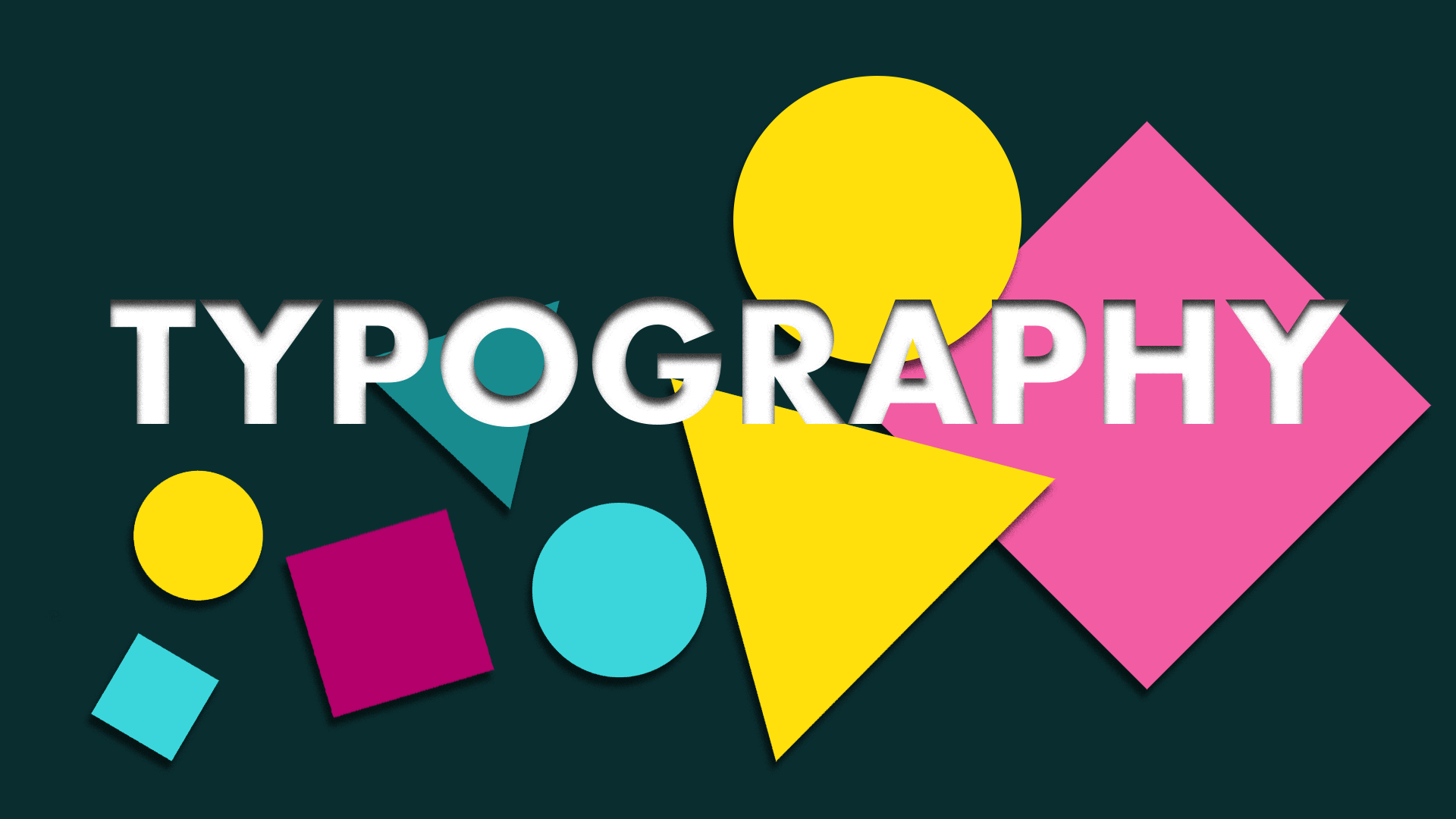
What is Kinetic Typography?
Kinetic typography (or text animation) is a motion graphics technique that combines text with animated elements to create movement and visual interest. It allows the animator to bring words and phrases to life, adding an extra layer of engagement for the audience.
It’s wrong to think of kinetic typography as a specific style or technique, as it is, in fact, a genre of animation rather which can be interpreted in many ways.
This short reel from some of our recent work shows just how varied the use of kinetic type can be.
Kinetic Type Reel
The history of Kinetic Typography
As a genre, kinetic type first appeared in a very basic form as long ago as 1899 in the work of the ground-breaking Georges Melies. Despite being regarded as the father of special effects, much of his work has been lost and there are no examples of his early text animation.
True kinetic typography trends didn’t emerge until the 1960s, featuring in numerous movie title sequences. This trend was kicked off in 1959 by Saul Bass for the titles of North By Northwest, which saw the animated text “flying” in from off-screen before fading out into the film itself.
Since then, techniques have evolved, as have the attempts to categorise the genre. One of the most widely accepted is Barabara Brownie’s specific classification system. She breaks kinetic typography down into two types, Motion Typography and Fluid Typography, with the former split out into Scrolling Typography and Dynamic Layout.
With all the groups and sub-groups, the term ‘kinetic typography’ starts to seem anything but straightforward. In truth, these categories are quite easy to identify.
Motion Typography – Scrolling Typography
This refers to any type that just moves along a plane. Whether it’s sideways, upwards, downwards, or even the advancing and receding motion you see in Star Wars.
It can work wonders when you have longer sentences or words, as it slows down the video’s pace, creating a smooth and effortlessly elegant vibe. On the flip side, a faster and more dynamic movement with some overlap adds that extra touch of energy.
In the text animation below, created as part of the award-winning motion brand identity work we did for investment bank, Hayfin, you can see elegant text animation that reinforces the brand’s quiet confidence.
Fancy a free consultation?
Our team would love to hear from you.
Click the button to book a meeting with one of our partners.
Any info you provide will help us research your brand in advance so we can make the best use of the time available.
We look forward to hearing from you.
Motion Typography – Dynamic Layout
In this case, the elements that form the type actually shift in relation to each other. You might notice that letters and words can move apart from one another either on a flat surface or even in three-dimensional space.
Having a dynamic layout is especially handy for videos that require impact or drama, as stated in the brief. Take this example, we combined 3D motion graphic animation with kinetic typography to move words and letters a physical space to show how the client D+B brings designs to life in the construction industry.
Fluid Typography
This form of text animation is a different, because letters don’t have to physically move around. Instead, they can change shape or evolve right before your eyes
In this example from the CIPs (Chartered Institute of Procurement & Supply)’s Annual Report video, we began with a dynamic layout and then show you a simple example of fluid typography, where the letters ‘stand out’ are painted across the screen.
Kinetic typography trends are always changing, and they’re a versatile tool for anyone working with text animation. You can use it in various ways – as the foundation of a creative proposal, to enhance a narrative, or to highlight specific moments within a script.
The animation style you choose depends on the story’s tone and how much the text needs to convey. And there’s a lot to consider when briefing “kinetic typography” – we haven’t even touched on the impact of fonts, kerning, leading, and other factors that have influenced many of the text animation examples we’ve seen so far.
Want to Learn More?
As a creative content agency, we are passionate about using our expertise to bring brands to life. We have a wealth of content for you to explore.
For a start, you can download our free Creative Brief Template which includes all the questions you need to formulate clear brief for any project:
Free Creative Brief Template
Or you can check out pages on related services that may be of interest
Get in touch with us today
If you are considering a type animation for your next campaign, we’d love to hear from you.