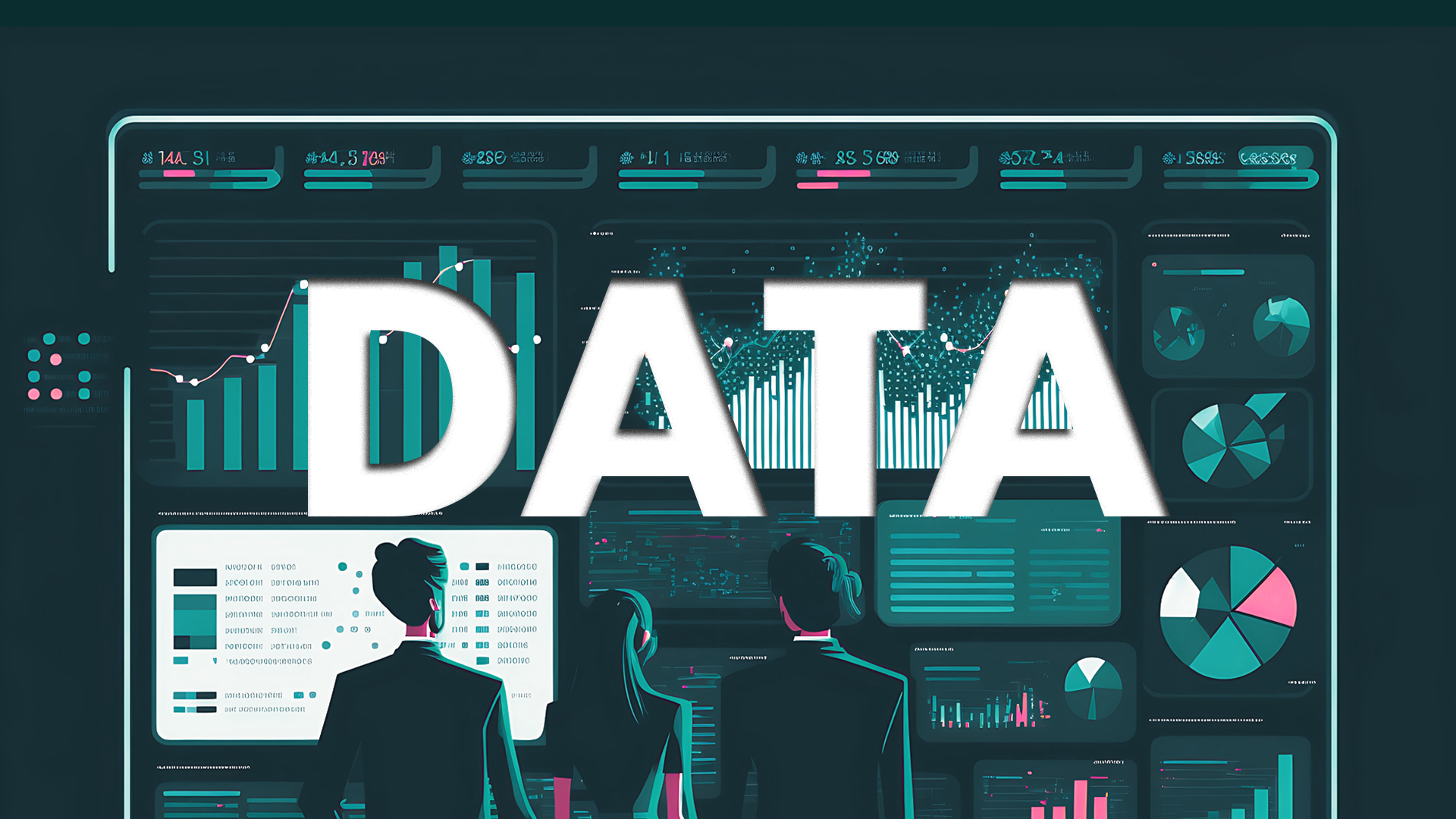
Data visualisation is the representation of data in an easy-to-digest format. It is an essential tool for businesses, researchers, and marketers as it enables them to identify trends, patterns, and insights that would otherwise be difficult to see.
However, with the increasing popularity of data visualisation, it’s crucial to find new ways to make your visuals stand out from the crowd. This is where animated infographics come in.
Animated infographics are graphics that incorporate animation, text, and images to present data in an engaging and interactive way. They allow for a more immersive experience and can help you communicate complex information more effectively.
In this blog, we’ll explore the benefits of using animated infographics for data visualisation and how they elevate your content to the next level.
Why Choose Animated Infographics for Data Visualisation?
Animated infographics offer several advantages over static visuals.
- Firstly, they can enhance engagement and storytelling capabilities. By adding movement, you can create a compelling narrative that draws viewers in and keeps them interested.
- Secondly, animated infographics can increase information retention and understanding. Dynamic visuals help to break down complicated data into digestible chunks, making it easier for viewers to understand.
- Lastly, animated infographics improve user experience and interactivity. By allowing viewers to interact with the visuals, you can create a more memorable experience.
What is an example of data Visualisation?
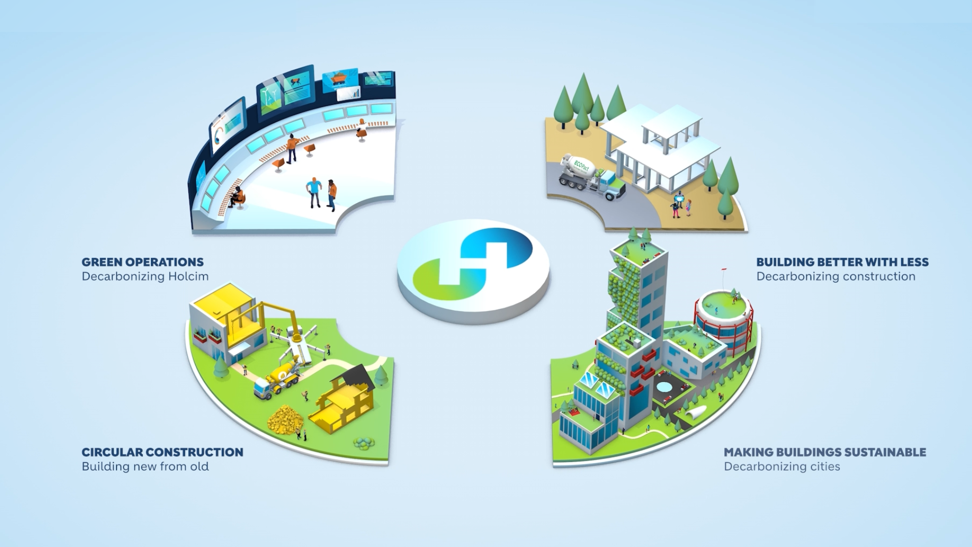
Earlier this year, we designed and animated a flagship infographic model for Holcim Group, outlining the future of their sustainable concrete business and bringing to life their concept of ‘Circular Construction’.
After the success of the model at launch, Content Creatures were commissioned to create an interactive infographic model for display on large touchscreens at exhibitions and events.
The touchscreen animation was displayed on a 75-inch screen in the Holcim booth at Bau München 2023. Guests to the booth were encouraged to navigate through the animation, learning about Holcim and their circular construction methods. It proved a success with the public, providing greater engagement and allowing Holcim more time to deliver their key messaging.
We also worked in collaboration with various departments to design and produce infographics to be used within company reports, presenting data across the Holcim website and in print.
Best Practices for Creating Animated Infographics
Creating effective animated infographics requires a strategic approach. Here are some key steps to consider:
1. Choose the right data and storytelling approach that resonates with your audience:
- Begin by identifying the main message or story you want to convey through the infographic.
- Determine your target audience and consider their demographics, interests, and knowledge level.
- Select the most relevant data sets to support your message and ensure the information is accurate and up-to-date.
- Craft a narrative that is easy to follow and presents the data in an interesting and compelling manner.
2. Select appropriate animation styles and transitions to effectively convey your message:
- Consider the tone of your message and choose an animation style that complements it. For example, a playful tone might benefit from cartoon-like animations while a serious tone might benefit from more professional-looking animations.
- Use animations that enhance the flow of the narrative and help the viewer understand the data better.
- Use transitions that connect the different sections of the infographic and guide the viewer through the story.
CAN WE HELP BRING YOUR CAMPAIGN TO LIFE?
Our team love meeting new people and hearing about potential projects they can help with.
Meet one of our Creative Partners and get a free creative consultation.
3. Incorporate relevant visual elements like charts, graphs, and icons to enhance the overall appeal of the infographic:
- Use visual elements that are relevant to the data being presented.
- Use consistent visual language throughout the infographic to help the viewer understand the relationship between different elements.
- Use contrasting colours and font sizes to highlight important information and make the infographic more visually appealing.
4. Optimise your infographics for clarity, readability, and aesthetics to ensure a visually impactful result:
- Keep the design clean, simple, and uncluttered.
- Use legible fonts that are easy to read even when the infographic is zoomed out.
- Pay attention to spacing and alignment to create a balanced and harmonious design.
- Preview the infographic on different devices to ensure that it is easily viewable on various screen sizes.
By following these steps, you can create animated infographics that are not only visually appealing but also effectively convey your message to your target audience.
What are Future Trends and Innovations in Animated Infographics?
With the popularity of animated infographics increasing, it’s logical to look to new technologies to see how we can evolve and create even more inviting visuals.
Advancements in Artificial Intelligence:
Artificial intelligence (AI) is changing the way we approach designing infographics. The technology allows designers to automate the creation of infographics, making the process faster and more efficient.
For instance, AI can help generate charts and graphs that are tailored to the data being presented. As a result, designers can focus on other aspects of the design, such as creating compelling narratives and selecting appropriate animations.
Interactive Infographics:
Interactive infographics are another trend that’s gaining popularity in the world of data visualisation. These infographics allow users to engage with the content by clicking on different elements and exploring the data in greater depth.
Interactive infographics offer a more immersive experience, which is ideal for complex data sets that require a deeper understanding. With the rise of virtual reality and augmented reality, we can expect to see even more dynamic and interactive infographics in the future.
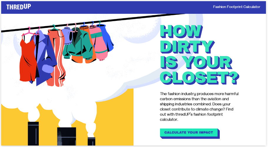
The below interactive infographic, ThredUp’s carbon footprint calculator, is a great example of how infographics can be both informative and engaging. It simplifies complex issues while remaining easily accessible.
Use of Video:
Video is an effective way to communicate complex information, and animated infographics are no exception. By incorporating video into animated infographics, designers can present data in a more engaging and digestible way.
For example, designers can use animation to take viewers on a journey ‘through’ a set of data, making the whole experience more immersive and memorable. Options to include video could be bespoke filming or high-quality stock that compliments the data being presented.
Mobile-first Design:
Mobile devices have become the primary means of accessing the internet, and designers are adapting their approach to accommodate this trend. As a result, mobile-first design has become increasingly important in the world of animated infographics.
Designers need to ensure that their infographics are easily viewable on mobile devices, which means prioritizing clarity and simplicity in the design.
Hybrid Infographics:
The future of animated infographics is likely to involve a hybrid approach, combining different types of media to create a richer experience. For instance, designers might incorporate static images, videos, and interactive elements into a single infographic.
This approach allows designers to tell more complex stories and convey information in a more compelling way.
With AI, interactivity, video, mobile-first design, and hybrid approaches, creatives have more tools at their disposal than ever before.
Conclusion
Animated infographics offer several benefits to data visualisation, including enhancing storytelling, increasing information retention, and improving user experience. By following best practices and embracing new trends, you can take your data visualisation to the next level and create impactful visuals that resonate with your audience.
So, embrace animated infographics and get in touch with us today to unleash their full potential on your next project.
