Empowering Voices
Animated video explainer
The PDA Society aimed to tackle misconceptions about Pathological Demand Avoidance (PDA) and enhance public understanding of its impact. Awareness of PDA is limited, often leading to individuals with PDA being overlooked or misunderstood.
We were briefed to create a 60-second animation for their end-of-year awareness campaign. The brief was to explore the experiences of individuals living with PDA in a way that resonates with a wide range of audiences, including PDAers, their parents and loved ones, teachers, employers and the wider public.
Client
PDA Society
Industry
Charity / Not for Profit
What We Did
- Animation
- Brand development
- Copywriting
- Creative strategy
- Digital assets
- Motion design
- Storyboarding
- Voiceover production
Project film

Building the Concept
We created the concept, ‘You don’t see how I feel’, to highlight the often unseen struggles of individuals with PDA (Pathological Demand Avoidance). By using visual juxtaposition, we aimed to place external perceptions alongside internal realities, illustrating the stark contrast between how PDAers are perceived and what they truly experience.
Many people have a limited understanding of PDA. Our concept seeks to bridge this gap by showcasing these differences, thereby increasing awareness and understanding.
Empowering PDAers’ Voices
Our approach to this project was deeply collaborative. We wanted to authentically represent PDAers, so we worked closely with the PDA Society, using focus groups to understand how they wanted to be represented.
Insights gathered from these focus groups, along with extensive research shared by the PDA Society, informed our script.
Our goal was to reflect the subjective and emotional experiences of a PDAer. By showcasing the frustrations and emotions involved in daily activities that many people take for granted, we aimed to create a powerful connection with viewers.
Visualising Internal Conflict
Each scenario highlights the emotional weight of PDA while also offering moments of understanding and hope.
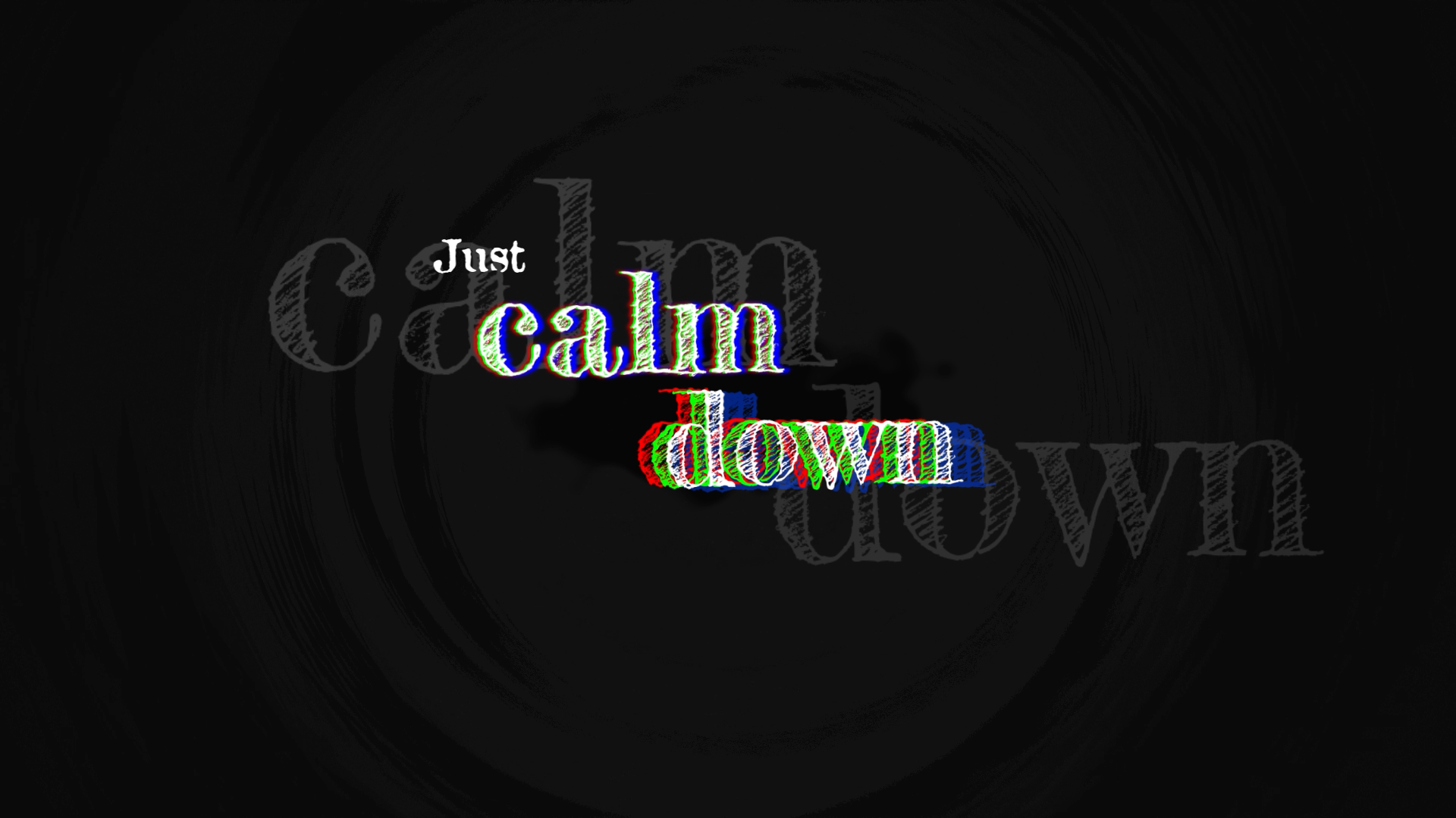
To achieve this, we employed visual metaphors such as burning, drowning, and heavy weights to represent internal conflicts, alongside subtle colour changes to reflect escalating or de-escalating emotions. All of these we inspired by direct quotes from our PDAer focus group.
The design process
The film is a combination of techniques; puppeted 2D, frame-by-frame, 3D, and typography. We chose movements, colours and compositions to contrast the darker, isolating ‘real world’ experience for a PDAer with their vivid, creative internal thoughts.